Chaotica


Click to enlarge.

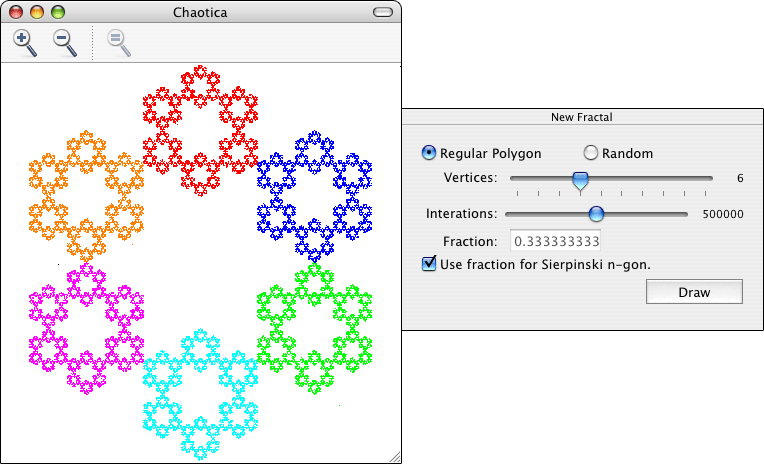
Chaotica is a Mac OS X application that draws fractals using the Chaos Game method. To use Chaotica you simply need to specify the number of vertices that will be used, how the vertices will be chosen, the fraction that will be used, and the number of iterations performed to generate the fractal. Chaotica will first choose a point inside the drawing area at random and then it’ll choose one of the vertices, also at random. Next, it will draw a new point at the chosen fraction of the distance between the point and the chosen vertex. After that, it will use the newly drawn point and pick a new random vertex and repeat the process to find the next point. Each time a new point is picked is called an iteration. You can change the settings in Chaotica to create many different fractals. Here’s a description of what each option in the New Fractal window and the Preferences does:

New Fractal window:

  • Regular Polygon – If selected, the vertices will be placed to form a regular polygon.
  • Random – If selected, the vertices will be placed randomly inside the drawing area.
  • Vertices – A number between 3-12. It determines how many vertices will be used to create the fractal.
  • Iterations – A number between 1-100,000. It determines how many points will be calculated.
  • Fraction – The fraction that will be used to determine the distance at which a new point will be added.
  • Use fraction for Sierpinki n-gon – Uses the fraction necessary to generate the Sierpinski polygon with the selected number of vertices. An explanation on how this works is coming soon.

Preferences:

  • Background color – Self-explanatory.
  • One color for all vertices – If selected, all points are drawn with the same color.
  • Color depends on the vertex – If selected, the color of the points depends on which vertex was chosen when calculating where the point should be. This option generates nicer looking fractals.


Welcome!

I think it’s finally time to start posting. I’m very proud of this new website, here’s why. I’ll start with the design. First of all, I like the buttons at the left a lot. I’ll admit that right now since there is only one button it looks a bit stupid, but trust me, when there are many buttons you’ll be moving your mouse around them just for fun. Also, if you are using a browser other than Internet Explorer you should see some really nice shadows on the sides of the main part of the layout. I did my best to try to get the shadows to work on Internet Explorer, but since IE has no respect for CSS, it wasn’t possible, so the shadows are not visible if you are using IE.

But the looks are not my favorite part of this new website. Again, if you are using a browser other than Internet Explorer, try making the text bigger. The whole page grows, not just the text. I think people should be able to choose whichever font size they’re comfortable reading and the design should adapt to it. No one should have to choose between ruining their eyesight and ruining the website’s layout. Another thing I like is how the website reacts to being resized. The web developer community often debates about which is better, liquid layouts or fixed layouts. Liquid layouts take advantage of the size of your browser window, but many users (especially those on Windows) cover their whole screen with the browser window which makes liquid layouts end up with really long lines which are hard to read. On the other hand, fixed layouts allow the web designer to have control over the length of the lines, but don’t really care about the size of the window and waste a lot of space because they are usually designed to work on small screens. But, why not combine both? Try resizing your window. When the window is small enough the layout will shrink and grow along the window, but when the window is too large, it will keep a fixed size to avoid having huge unreadable lines.

The last thing I really like about my new website is that it is easily updated. The entire website uses WordPress, but there are two different types of pages. One type is for my blog posts, and the other one is for the rest of the categories. My blog is pretty much what you would expect from a blog, except that it does not use categories. Instead, the categories are used for the sections of my website and tags are used to classify the blog posts. The non-blog categories are displayed in a more article-like way. But regardless of which type of page it should be on, to post anything new, I just need to create a new blog post and place it in the right category. WordPress was very easy to work with, and I even wrote some plugins to make formatting my posts easier. For example, I can use a bunch of fancy tags for different purposes such as posting spoilers, images of other types of content. Check this out: Show Spoiler You have been spoiled. Or this: Show Content

Look! It’s above the rest of the website, and you won’t see it if you are not interested.

I’m still not sure what I will do with the last one, but it looks nice, doesn’t it? Anyway, that’s all there is to my new website. I’ve been doing a lot of testing lately and I think that everything is working. There is only a small problem with the tag pages, but I’ve tried everything I can think of to fix it and nothing worked. I’ll try to add some more categories and some content over the week.